Composite: A Magical Moment

Formal Assignment #2: A Magical Moment

MagicForest2-Edit

Project Reflection:

Exposure – How did you use exposure techniques to create your image?

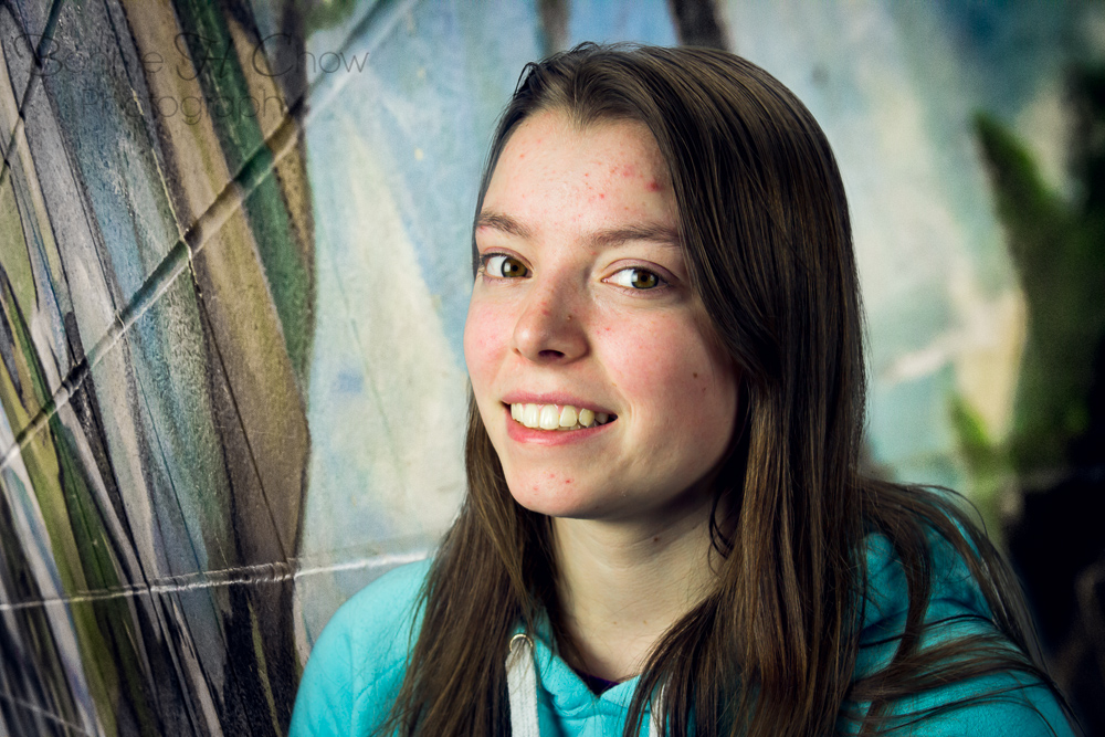
Exposure was tricky to get just right in this photo as there is such a difference between light and darks. In the final product, I found that this contrast gave the photo a defined element, which I liked. I also tried to balance this out by bring out luminance in the greens and oranges (Lightroom) and also by added some noise reduction. Dreamscape and starburst effects were put on the background scene to give the forest a hazy, surreal ambiance. The starburst effect was added by creating two duplicate layers of the background and putting a 45 degree motion blur on and a -45 degree motion blur and the other. By changing the blending mode to “screen”, the bits of sunlight coming through the trees were diffused and made into “starbursts”.

Elements and Principles of Design – How did you use composition techniques to create your image?

The trees and the starbursts of light frame the entire image drawing the eye to the subject. Contrast was a predominant element used in this photograph. I adds depth a certain edginess to a conventionally soft image. This photo follows conventional composition techniques as the subject is place on the vertical right rule of third line.

Lighting – How did you use lighting techniques to create your image?

While shooting the forest scene, I kept the lighting in mind, especially where the shadows would fall. The sunlight was quite harsh that day which created some harsh shadows. When shooting the girl, I wanted to capture a rim of light around hair with backlight to give her a fairly-like feel. A shadow of the girl was added in Photoshop to tie the photo together in terms of blending the lighting.

Post-Production – How did you use post-production techniques to create your image?

Working with and manipulating layers was once again practiced when creating this composite.

Dreamscape filter added to background layer in Photoshop.

Starburst effect added to entire photo in Photoshop.

I used a special brush in Photoshop to create the little sparkles around the girl. I was going for the “magic fairy-like” look.

A shadow of the girl was added to finish off the photo.

Global and Local adjustments were adjusted in Lightroom. (ie. shadows, white balance, highlights, luminance, vibrance, saturation… )

Photographic Styles – What techniques were used to create your Photographic Style?

Through this project, I now pay a lot more attention to lighting, composition, and the little things in photos. This kind of falls into the nature, magical scene with lots of post-production. You can pretty easily tell it is heavily processed in post-production. I do not usually get the chance to do this much editing on a photo so I thought it would be good to do at least some.

Bottle Splash

Recently I have been working on producing composite images. I just completed my second Photoshop composite of the semester. Here are the photos it consists of.

BotleSplashFinal-2     IMG_8865-Edit

Post Production:

White background added.

Layer masking after selections to get the separate parts.

Displacement mapping was used to create the blur of the bottom of the bottle as the eye would see it through the water.

There were two layers of the splash itself; one above and one under the bottle layer. The opacity of the one on the top was lessened in order to let the bottle show through a little more. (in a gradient manner, less opaque near base) The splash was also warped and transformed to shape to better work with the shape of the bottle. The opacity of the reflection was also brought down.

Level adjustments were added to blend the lighting further.

BotleSplashFinal


I like the detailed sharpness of this photo and the fresh blue/green tones. Something I noticed that could be improved is that the edges of the bottle are not very distinct because it is too “blown out”.

Graffiti and Texture

Street art can be found everywhere in a urban setting. Sometimes I just walk past some of them in awe. The use of colour, line, and form is incredible. I took my camera with me one day around the city and shoot all the art in the street that I came across. I thought I could make use of theses photos in composite images and I just found them very intriguing, especially shot at different angles. Each of the following capture a certain element that stood out to me.

IMG_1308

I like the use of colour and contrast and the “grungy” effect it gives.

IMG_1310

The gold used here is unexpected. It was a overall disorganized beauty.

IMG_0814

The neon shades stands out against the rough texture of the wall.

IMG_0813

 The peeling texture of this wall stood out to me. I really like the complementing effect of blues and oranges.

Composites in Post Production: Trial 1

This week I focused on building my techniques and workflow for creating composite photographs. To begin, I figured I would combine a studio lit photo of Erica and a background with interesting texture and colour to begin constructing a basic composite in Photoshop. One of the most important things I learned was how to adjust and correct the lights and darks by utilizing a black and white layer; also adjusting and correcting the colours by using levels and/or hue and saturation layers in Photoshop. Clipping masks were used to only apply the layer effect on select layers. Global adjustments were used to further blend the hues and tones of the two photos together. I also learned more advanced techniques for refined edges of my selections, which is very important in fine tuning and details of the photo.

IMG_0758-Edit

I was going for a edgy textured background with cooler colours to complement Erica’s blue hoodie in the first photo. I also wanted to create a higher contrast  overall to go with the edgy theme as some of the colour and tone blending using levels flattened the photo a bit.

IMG_0767-Edit

In this photo, I leaned more towards the warmer, pink tones. Her face is still a bit brighter compared to the background. This should be further adjusted in Photoshop. A soft lightening of the background behind my subject was added to separate her from the background more.